
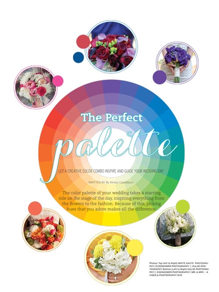
Let a creative color combo inspire and guide your wedding day
By: Kelsey Casselbur
The color palette of your wedding takes a starring role on the stage of the day, inspiring everything from the flowers to the fashion. Because of this, picking hues that you adore makes all the difference.
In most cases, you’ll need to pick at least three colors, though some designers even recommend up to five. At minimum, choose a dominant shade — this should be your favorite hue; the one that takes up most of the palette — as well as two secondary colors. One of these accent colors can be a neutral, such as white, cream, black or grey — or not, as you might opt for two additional bright pigments and then add a fourth or fifth color in a neutral tone. Let your favorite hue take center stage with two-thirds of the attention, and then add visual interest with a complementary hue to filling out the remaining one-third. Resist the temptation to showcase the two main colors as a 50-50 split because it can overwhelm the reception with too much color.
But which colors should you choose? Take into consideration which colors flatter your complexion. Even though you’ll likely be wearing some variation of white, your bridesmaids — who will be surrounding you — will be wearing the dominant color of your choice. Therefore, a bride who looks best wearing purples, blues or deep greens should translate that into her color palette, rather than selecting less-flattering reds, oranges and pinks. Finally, don’t get hung up on the shades matching perfectly. No one but you will notice nor care if the bridesmaid dresses are a different shade of green than the tablecloths — in fact, purposely using several shades of the same color adds a little something extra to the overall color scheme.
If you need a little help finding the right vibe for your wedding day, take a look at these six color combinations. Unlike some pairings, these fresh groupings won’t look overdone on your wedding day—and some guests just might be in awe of your creativity and taste.
Six Fresh Color Palettes
Dominant color: Emerald green
Secondary colors: Lapis blue, deep mint

Emerald Green is the Pantone color of the year—and for good reason! This hue is super-luxurious, calling to mind gemstones and peacock feathers; pair with a just-as-rich deep blue for an ultra-glam look. Just think about how gorgeous it will look if your bridesmaids are donning classy emerald green gowns with deep blue jewels (real or faux is dependent on budget) as accessories. Let the deep mint color shine in bits and pieces across the reception as a way to lighten things up. Rather than sticking with matte hues, aim for iridescent versions — it will make it all feel little bit swankier.
Dominant color: Peach
Secondary colors: Blush pink, vanilla

Rather than follow the bright color trends of years past, take a fresh look at pastels — but not in the 1980s Pepto-Bismol pink kind of aesthetic. Rather, pull inspiration from soft spring hues such as pale peach and a blush pink. Skip the urge to pair this color combo with a bright snow white; a creamy vanilla will keep the palette in the vintage, romantic aesthetic. For a little 1920s glitz – think Great Gatsby – add a sprinkling of glittery gold into the mix.
Dominant color: Berry and Pink
Secondary colors: Aquamarine, muted silver-gray

Calling all warm-weather brides! This tropical color combo will add pep to any and all nuptials, while a pale grey accent color just gives it a touch of freshness (in contrast to the standard white accent color). Just picture it: The men suited up in a classy grey suit; the bridesmaids in a shade more akin to a pink rose than the neon alternative. The cheeriness of aquamarine – more blue than green – offers a lively complement.
Dominant color: Plum
Secondary colors: Lilac, navy blue

This color palette really shines due to its versatility — Whether you’re getting married during spring or fall, in a hotel ballroom or on a yacht, a plummy purple highlighted by a lighter shade of the same color and accented with classic navy just works. Dress your ‘maids in deep purple gowns and accent it with bouquets of paler purple and white flowers; maybe even throw in some light blue hydrangeas for good measure. Deep purple is the “it” color as of late, so brides who go for this combination will be in good company.
Dominant color: Lemon yellow
Secondary colors: Grey, navy blue

‘Twas never anything fresher or brighter than the shades of sunny yellow – except when it’s paired with navy! This is a springtime color combo if there ever was one, but the addition of grey makes it translate to the summer months, too. One of the most popular uses of the sunny yellow hue is in the ultra-hip ombre form, whether on cakes or stationery.
Dominant color: Merlot
Secondary colors: Eggplant, coffee

How about a color combo that’s just right for the late fall and winter months? The saturated dark red hue inspired by a bold wine provides a stunning base for this cool-weather palette, while the rich purple eggplant and coffee colors offer just the right complement. This is just right for the type of wedding that occurs in the evening, made magical by flickering candlelight and free-flowing wine.
View The Digital Edition
Buy This Issue